
Wouldn’t it be nice if policy scholars and professionals could have frequent and fruitful discussions about policy and policymaking? Both professions could make valuable contributions to our understanding of policy design in a wider political context.
However, it is notoriously difficult to explain what policy is and how it is made, and academics and practitioners may present very different perspectives on what policymakers or governments do. Without a common reference point, how can they cooperate to discuss how to (say) improve policy or policymaking?
One starting point is to visualize policymaking to identify overlaps in perspectives. To that end, if academics and policymakers were to describe ‘the policy process’, could they agree on what it looks like? To help answer this question, in this post I’m presenting some commonly-used images in policy research, then inviting you to share images that you would use to sum up policy work.
Why produce different images of policy processes?
One obstacle to a shared description is that we need different images for different aims, including:
- To describe and explain what policymakers do. Academics describe one part of a complex policy process, accompanied by a technical language to understand each image.
- To describe what policymakers need to do. Practitioners visualise a manageable number of aims or requirements (essential steps, stages, or functions), accompanied by a professional in-house language (such as in the Green Book).
- To describe what they would like to do. Governments produce images of policymaking to tell stakeholders or citizens what they do, accompanied by an aspirational language related to what is expected of elected governments.
Why seek a common image? Would it help or hinder discussion?
If we have such different aims, is it (a) possible, and (b) desirable to produce an image that satisfies each aim? For example, it is possible but undesirable to use the policy cycle image to that end.
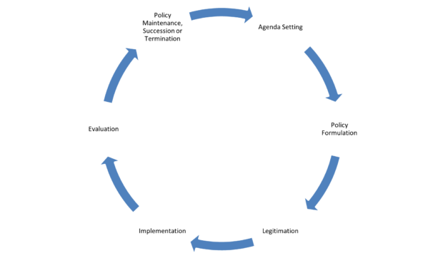
This image may be shared by academics and practitioners, but it means something different each time:
- Most policy scholars use the cycle to describe what does not happen. It is a teaching tool, to (a) describe the ideal-type, (b) explain its descriptive inaccuracy, and (c) introduce the search for better models, which (d) might help to visualise a messier reality (for example, by using Spirograph).
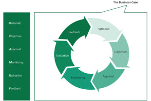 Practitioners often find it more useful to sum up the steps they need to take - to get from defining to addressing a policy problem. For example, the ROAMEF cycle looks fairly similar to the one in my textbook. However, most policymakers would describe their actual steps in different ways or – more importantly - accept that no-one really makes policy this way.
- Policymakers find it useful to project to the public that their process is orderly. You will find many versions of this image in UK government and European Commission documents, using images to summarise how they would like to be seen.
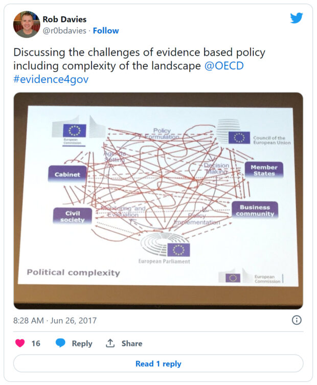
In each case, the policy cycle image represents a confusing mix of (1) valuable to prompt further discussion, and (2) not valuable because it is so misleading. Indeed, even (one small part of) the European Commission presents a very different image, to superimpose an unwieldy mess onto the traditional cyclical image.
What images do academics use to explain complexity?
While an image of messy policymaking makes a simple point well (policymaking is far messier than the cycle suggests), it does not do much else. What other images convey this complexity while also providing specific insights to guide research or action?
Policy theories help to visualise complexity in a range of useful ways. What follows are some examples...
Visualizing with metaphors
 The multiple streams framework: much like a space launch, major policy change will not happen unless many requirements come together simultaneously. In policymaking, the requirements are: attention rises to a problem, a feasible solution already exists, and policymakers have the motive and opportunity to select it. Policy entrepreneurs may help, but as surfers riding a wave, not controllers of the sea (apologies for the mixed metaphors).
Take home message from image 1: ‘stages’ of a policy cycle matter, but the process (1) is not linear, and (2) does not lead inevitably to policy change.
Visualising data
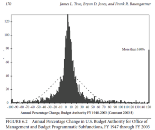 Punctuated equilibrium theory: this image sums up the distribution of policy change in liberal democracies: there is a huge number of very small changes, and a very small number of huge changes. This distribution is akin to the frequency and magnitude of earthquakes! What is the cause? (1) Policymaker attention to problems does not relate strongly to (a) the size of the problem, or (b) the available information. (2) A lack of attention results - in most cases - in limited change (since high attention may be required to help overcome existing rules and practices).
Take home message from image 2: Policymaking is largely about governments managing existing policies which can change very little for long periods. Major changes can happen, but they are rare. They can be explained, but are not easy to predict.
Visualising important factors
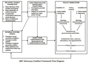 The advocacy coalition framework flow diagram: people join ‘advocacy coalitions’ to turn their beliefs into policy and they compete with other coalitions to influence policy in subsystems (specialist networks of policymakers and influencers). Policy change relates to how coalitions manage internal dynamics (such as learning from policy failure) or deal with external events (such as a crisis or change of government).
Take home message from image 3: Most policy is processed in a large number of specialist policy networks, which are more or less insulated from the wider political system.
Visualising concepts in a non-threatening way
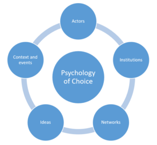 The blue turtle: - my aim is to introduce concepts in a visually pleasing way (to compete with the policy cycle). The image provides an introductory story about how policymakers deliberate and make choices (drawing on psychology to show how they frame problems and identify trusted sources of information) while surrounded by their policymaking environment (consisting of many policy actors spread across many venues, each with their own rules, networks, and reference points).
Take home message from image 4: Policy is processed by many different ‘centres’ – each with their own ways of working - rather than one single central government. The overall effect cannot be summed up by one single cycle of activity, and the overall ‘policy mix’ does not emerge from one source.
What images do you find more useful?
My main aim has been to present these images to prompt discussion: what does each image say about how we describe policymaking, our role in policy processes, and how we would like others to understand what we do? Do you prefer other images, such as to describe the ‘strategic triangle’?
I would welcome your thoughts in the comments below. Or, if you have some valuable images to share, please send them to p.a.cairney@stir.ac.uk
Join our community
We use this blog to talk about the work of the multidisciplinary policy design community. We share stories about our work, the thinking behind it and what policymaking might look like in the future. If you would like to read more, then please subscribe to this blog. If you work for the UK's government, then you can you join the policy design community. If you don't work for the UK government, then join our AHRC Design and Policy Network.
3 comments
Comment by Brian Morgan posted on
Thanks Paul. I've been looking at MSF and ACF from a design perspective recently as part of my PhD. What policymaking looks like is crucial to elicit citizen participation, in my view (though, as a designer, I would say that !).
Just this week I was looking at Neil Bouwer's attempt at visualisation, have you seen it? Being an metaphor enthusiast, you may enjoy his 'goggles'...
https://www.youtube.com/watch?v=rQq8UGbno8k
Comment by Paul Cairney posted on
Thanks Brian. Looks like a good example to add to the list. I'll try to collate and compare them. For example, I think that a lot of examples will be trying to sum up what people should do (whereas most of the ones I described try to sum up what people do).
Comment by Chris Roche posted on
Sandwich Strategy pic from Jonathan Fox helps usefully draws out politics and interests in and around the policy space
https://www.researchgate.net/publication/269100370_Social_Accountability_What_Does_the_Evidence_Really_Say/figures?lo=1