Between May and October 2020, a multidisciplinary team of policymakers, researchers, designers, analysts and delivery managers completed the discovery phase of a project about transforming policymaking in the UK.
There were two high level elements to the research. The first element was desk research which identified existing evidence and academic research that already existed about policymaking. This evidence was then analysed in the context of the questions that our discovery was trying to answer. The second element was primary user research which included interviews with policymakers and a cross-government journey mapping strategy. In this blog post we’re going to talk about mapping and what it revealed
As service designers our role is to understand and design accessible and impactful services, products and policies that meet user needs.
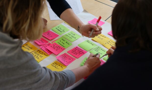
During the discovery, the team facilitated journey mapping workshops in 14 organisations with 128 policymakers across government. Our intention was to describe, discuss and map the current policymaking process and the stages policymakers work through. Starting from the trigger for a policy review or change, we wanted to find out what the key activities, enablers and obstacles along that journey were.
What we learned about policymaking
Policymakers often say they are taught about linear models for making policy, like ROAMEF (The Green Book, p15), but almost no-one we spoke to said that day-to-day policymaking followed these rules. So our hypothesis was that policymaking is very different in each department.
Most participants pointed out that the policymaking journey is not linear, nor is it cyclic. It’s like snakes and ladders, with numerous barriers at the top of each ladder. The start of the journey is similar across departments, it varies in the middle and at the end seems to lack clear activities. The journey map was “activity heavy” towards the left hand side.
There is something about the left to right nature of what policymakers do. They all go through a series of common stages but the order or level of engagement with each stage could be very different. Everything - taken together - is a journey, but we surmised that it is inaccurate to shoe-horn policymakers’ work into a linear process.
We found that some elements of the policymaking process are highly important for delivering meaningful outcomes for citizens but are rarely undertaken. Conversely, some of the things that policymakers spend a lot of time doing provide little value to themselves or citizens.
Our approach
Ahead of any journey mapping workshops we pulled together and affinity sorted the high level stages of policymaking that were discovered by three previous, separate research projects about the policymaking process.
We needed a framework to collect our data so we decided on the grid structure of a journey map. We were aware that by using this structure it suggested the journey follows a logical sequence even when in reality it doesn’t.
The policymaking journey is not always linear and can iterate back and forward through various stages, but by mapping something in this way it enabled our workshop participants to focus on the content rather than the layout. By content, we mean things like the activities policymakers perform at each stage and the tools they use to perform those activities. By designing the layout like this we provided them space to focus on their own process without losing control of the data we were collecting. As designers, it allowed us to easily see opportunities, gaps and pain points, and associate those with particular stages of the journey.
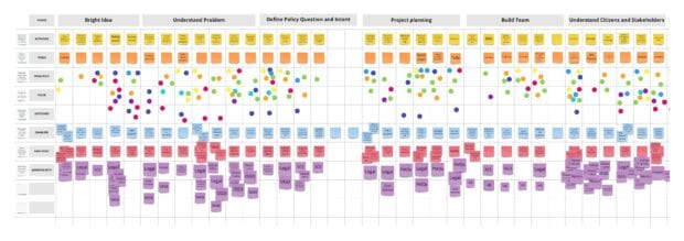
At the start of each workshop, we presented policymakers with our stages all jumbled up and asked them to put the stages in the right order. Although it didn’t always feel complete or definite, and we didn’t always get complete consensus, we did gain enough confidence in the high-level structure before trying to map at scale.
Next, we broke into breakout groups to identify the activities a policymaker might perform at each stage of the journey. For each activity we then began to identify the enablers and pain points associated with each of them.
In order to get a full picture of policymaking across the UK, we wanted to map the policymaking journey across as many government organisations as we could. By designing a journey mapping toolkit, we were able to support a number of policy design teams in other departments to facilitate their own workshops. We held post-workshop “retros” or retrospective meeting with each of these departments to further iterate the toolkit.
Our approach utilised the power and energy of co-design and collaboration, seeking input from policymakers, based directly on their experiences of creating and delivering policies.
Understanding value
We also asked policymakers what they thought about the value of each stage. Once we had processed all of the journey mapping data that was collected during this discovery, we were able to clearly demonstrate three clear views from policymakers, in relation to the common stages.
- The frequency of policymaking activities within each stage
- The value policymakers place on those activities
- The extent to which those activities contribute to meaningful outcomes for citizens
An important aspect of any journey mapping activity is the analysis and synthesis of the data we collected. We took the outputs from each workshop and grouped, tagged, re-grouped, mapped and looked for patterns until we had a consensus or clearer understanding of what we had found.
As we had used the same format across 14 public bodies, we were able to quantify some of the findings and demonstrate where, for example, things were “painful” for most departments or where there were unique pain points for one department.
We created another grid-like structure to analyse and theme all the note-takers notes from each workshop, and used these to build the stories that would go on to inform ideation sessions.
The design challenges we faced
Firstly, like everyone else in 2020, we were all working remotely. We designed and developed a journey mapping toolkit using an online whiteboard tool, and also a version in a spreadsheet for those who had limited access to online platforms.
By creating a structure and framework for this research that was easy to follow, we were able to farm it out to the policy reform team and other departments who had willing facilitators. Because the workshop data was all digitised, departments that had facilitated their own workshops could easily share their data and their findings back with us.
There were many technical challenges for us as facilitators, not least the variety of video conferencing technologies used across government. We also realised as facilitators that not only did we have to teach and engage policymakers to use new tools, like an online whiteboard, but we also had to explain the basic concepts of mapping a journey, end-to-end.
During the discovery we generated a huge amount of analysis debt from the data from all three research methods - desktop research, 1-1 interviews and journey mapping workshops. In hindsight we could have scheduled in time for more frequent analysis during our planning sessions.
Finally we reflected on the groups of policymakers who attended the mapping sessions. Where they might not have either known each other or had a shared way of working, would they have felt safe talking about “their” process. Although we worked with people from the same department, we could have done more to ensure the space was psychologically safe.
Join our community
You can find out more about our research by downloading our report. You can see the graph and the data about each stage in more detail on pages 45-49, and a breakdown of what we found about each of the stages of policymaking in the annex on pages 95-111.
We use this blog to talk about the work of the multidisciplinary policy design community. We share stories about our work, the thinking behind it and what policymaking might look like in the future. If you would like to read more, then please sign-up for updates. Join the conversation by commenting below.